The aesthetic of the neomorphism method can be achieved by using selective shadows overlaid with semi-flat colors, which is similar to digital highlighting and dithering with effective results. This type of design is suitable for elements such as buttons, search bars, and text boxes. While sites with advanced responsive design are suitable for icons, product specifications, and functionality.
- Animated Feel
It’s no wonder that the “moving inflatable tube man” has become a staple of advertising. This success stems from the fact that movement attracts attention, and when you can attract more attention, you will get more customers.
Recently, technological advances and a move away from strict minimalism have led brands to move towards an interactive approach to digital design. With the use of precise animations, extensive page transitions, and many layers of interfaces and movements, web design has moved beyond static.
One of the things that animation can do is provide visual feedback to your site’s users. Navigation is one of the most precise forms of communication, and website designers are constantly trying to find unique ways to enhance the visual feedback of the user, using everything from multi-directional page transitions to animated images.
If you’re looking for something even more innovative, check out parallax animations. With the ability of web designers, page elements can be divided into the farthest points of the foreground and background, creating a parallax effect. In the optical illusion, objects that are closer to the viewer appear to move faster than objects that are further away.
These website design ideas provide the best tools for e-commerce sites, allowing them to showcase their product features and guide users from galleries to product reviews. It is also an interesting strategy for educational websites that want to attract children to their site.
. Electric coloring
The appeal of bright, vibrant colors is something that never gets old, and the way to discover them is still evolving and improving. If your brand is cutting-edge and is used in industries such as technology and media, using a bright color in moderation is all you need. An energetic, artistic, or intellectual viewer will appreciate and connect with such color choices.
One simple and effective way to show creativity in color is to combine and intensify different shades into
gradients.
Gradients are an easy and beautiful way to add energy and movement to your design, creating an attractive aesthetic that can be expanded upon with the use of three-dimensional colors. This is completed by shading and giving the design elements a rounded look.
This visual effect is very practical and you can use it skillfully to make the consumer experience easier for your customer.
Or you can use it in neon contrast against dark modes and create an energetic and unforgettable atmosphere. Gradient surfaces go back to the era of the Internet and early website design. This means that they are combined with a sense of nostalgia or specific old designs to create modern website design.
- Think abstractly
Instead of using photography in your digital design, you can get creative with geometric patterns and abstract shapes. Depending on the industry you’re in, you can set yourself apart from your competitors by avoiding stock images and predictable layouts. Abstract patterns expressed in various forms on your site have the ability to create an overall mood for your website and brand.
In addition to graphics drawing attention to your main products or call-to-action buttons, you can connect with your viewers emotionally by balancing a multi-product gallery layout with a good identity for your brand.
Simple shapes like squares and circles can evolve into complex, sprawling compositions, adding originality and interest to your website. Even without knowing the faces of the people, abstract elements can evoke emotions, resulting in a collection of web pages that are artistic and impactful.
Start-ups should pay attention to this website idea, as it is the best way to direct attention to the products, their functionality, brand beauty, and thoughtful identity. In fact, Tristan L. Burton, creative director of 99 Designs, predicts that by 2021, abstract art elements will be used as a replacement for photography in website design for startups, technology products, and computer applications.
- Tell them where to go
Typically, your website’s homepage displays your latest product offerings and company goals.
Now what if the navigation menu was the most important part? In most cases, using the navigation menu is another step that every customer takes, so your menu should be visually appealing.
While your website can be very attractive, it creates the best experience for your customers if it is easy to navigate.
Don’t forget that you can show your brand identity by properly integrating elements such as colors and fonts. This is a unique strategy for e-commerce and is a great point of interest for art portfolios or companies with special call-to-action buttons.
Vintage vibes
Using vintage website design can bring a sense of nostalgia, warmth, and intimacy to the now-too-digital and cold internet. Using old fonts, pale textures, and esquimorphs can evoke such feelings. For example: If you are a craft baker, photographer, screen printer or vintage clothing brand and the client is looking to recognize and trust your craft, you can give them a sense of comfort by providing a classic website design.
Check out the website for screen printer Textilschmiede above. The website has a vintage and classic look, achieved using a pale white background, an old-fashioned image of a screen printer, a typewriter pen and an album of faded photos showing the screen printing process. Through these elements, they show their customers that they have been experts in printing methods since ancient times, and their expertise is especially relevant to a time when printers paid great attention to detail.
- Go textual
Let the text speak with bold designs. Their font choices, sizes, colors, and typographic layouts are varied. A design can draw the focus to your message while being simple.
In website design that features heavy text, you can go for minimal or maximal. If your brand is sensitive, well-known, or soothing, it’s best to look at minimalist approaches with sans serif fonts. In this style, these fonts are thin, and by creating a lot of space between elements, you can eliminate unnecessary elements and make room for the necessary ones.
This type of branding can appeal to customers who think logically and methodically or who favor simple, purposeful messages. If your brand is bold, exaggerated, and full of energy, consider a maximalist design with large blocks of text that cover the entire page. This style is interesting for people who live by the mantra of “do great things or go home.”
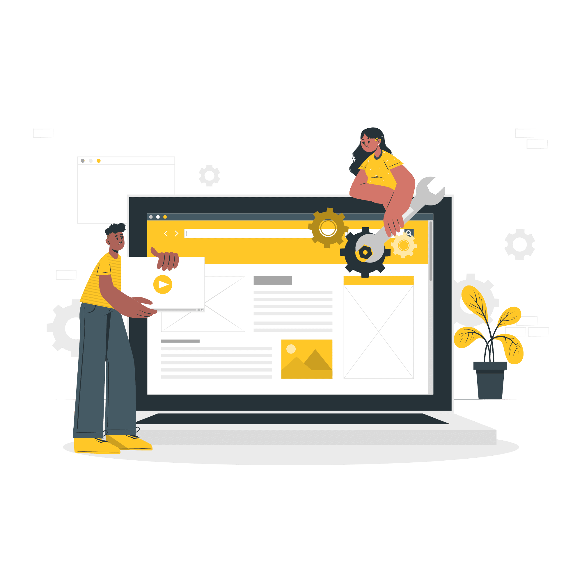
- Website Design Ideas That Work
If you’re working on a new website, we hope you can use these inspirations as a starting point for your website design. Once you figure out which of the aesthetic themes mentioned above are compatible with your profession, these design ideas can guide you in the right direction. Before you know it, you’ll be connecting with your clients and customers online.