
Today, more than ever before, internet users access websites via mobile. According to global reports, more than 55% of internet traffic is from smartphones. With this statistic, ignoring mobile means losing more than half of your potential audience!
In this situation, developing mobile-friendly websites should be considered as a vital option for online survival of businesses. In this article, we will examine the technical, marketing, user experience and SEO reasons for websites to be mobile-friendly.
Part One: Why is it necessary to develop mobile-friendly websites?
1. The increasing growth of mobile users
Today, more people use mobile phones to search, shop, read and communicate instead of using a laptop or desktop computer. This paradigm shift has made the mobile user experience of great importance.
✴️ A mobile-friendly website makes the user have a convenient, fast and effortless experience with the phone, just like on a desktop.

2. Direct impact on SEO and Google ranking
Google has been using the Mobile-First Indexing algorithm since 2018; that is, when ranking sites, it first checks the mobile version. If your site does not display well on mobile, its ranking will drop even on desktop.
✅ Developing mobile-friendly websites = improving your position in Google search results.
3. Improving user retention rate and reducing bounce rate
A user who enters a site and has to constantly scroll, zoom, or find it difficult to find buttons will leave it very soon. In contrast, sites that are optimized for mobile keep the user on the site longer.
📉 High bounce rate means user dissatisfaction and ultimately, a decrease in the site’s credibility with Google.

4. Increasing conversion and sales rates
For online businesses, mobile is not only a communication channel, but also a sales platform. Users expect to be able to:
Fill out forms.
Make purchases.
Review and compare products without any problems.
Call or send a message via WhatsApp and online chat.
If the site is not mobile-friendly, these simple steps will become a big problem and will ultimately lead to a decrease in sales.
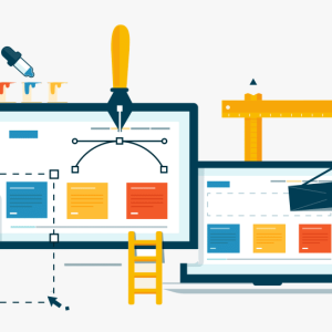
Part Two: Features of a Professional Mobile-Friendly Website
Developing mobile-friendly websites is not just about shrinking the desktop version; it also requires careful design and development based on the needs of mobile users. Below are its most important features:
1. Responsive Design
The most important principle in developing a mobile-friendly site is that the site components adapt to the screen size. Responsive design ensures that:
Text is readable.
Images are not too large or small.
Buttons are clickable and recognizable.
The page layout is not cluttered.

2. High loading speed on mobile
Mobile users usually use limited and medium-speed internet. Therefore, if the site loads slowly, there is a high chance of leaving it. For this purpose, you should:
Optimize images.
Use browser cache.
Remove and compress extra code.
3. Simplify menu and navigation
Mobile space is small, so we should not have complex and multi-layered menus. Designing hamburger menus or horizontal/vertical scrolling can improve the user experience.
4. Clickable elements

In mobile design, buttons and links should:
Have sufficient distance from each other.
Be large enough.
Be placed in accessible points of the page. (such as the bottom or center of the page)
5. Test with Google Tools and Browsers
To ensure that the site is mobile-friendly, it should be tested with tools such as:
Google Mobile-Friendly Test
Google PageSpeed Insights
Chrome Browser DevTools
and fix the errors.
6. The Role of User Experience (UX) in Mobile-Friendly Design
In developing mobile-friendly websites, it is not only the appearance that matters; the overall user experience when interacting with the site is also very important. If a site is designed for mobile but:
The user has to zoom in to read the text.
The buttons are not in the right place.
Or the purchase and registration process is complicated.
A poor user experience will make the user not return to the site. Mobile-friendly design should prioritize simplicity, clarity, and easy access.
7. Responsive Design and Building Customer Loyalty
When a site is displayed correctly on all devices (mobile, tablet, desktop), the user will feel more trust in that brand. This trust can lead to customer loyalty in the long run.
✅ Loyal customers trust brands that care about their experience — and that means responsive and mobile-friendly design.
8. The difference between app development and a mobile-friendly website
Many businesses assume that having a mobile app is enough. While any app requires installation, many users may prefer to use the website directly.
Criteria | Application | Mobile-friendly website |
Installation required | ✅ Yes | ❌ No |
Direct access from Google | ❌ No | ✅ Yes |
Requires storage space | ✅ Yes | ❌ No |
Suitable for general users | ❌ Limited | ✅ Yes |
So even if you have an app, developing mobile-friendly websites should still be a priority.
9. Competitive advantages in the online market
In today’s competitive digital space, a mobile-friendly website can make the difference between success and failure. If a user has a better experience when visiting your site than their competitors, their likelihood of buying, calling, or registering increases.
10. Successful examples in developing mobile-friendly websites
Big sites like Amazon, Booking, Google, and… all have very detailed mobile-friendly designs. In Iran, brands like Digi Kala, Snap, and Divar have been focusing on mobile experience for years, capturing a high market share.
Analysis of the behavior of users of these sites shows that:
More than 70% of their sales are made via mobile.
The site speed on mobile is less than 3 seconds.
Buttons and forms are designed to be finger-centric.
✅ Conclusion: Why is developing mobile-friendly websites vital?
Developing mobile-friendly websites is not just a technical and design exercise, but also a way to:
Increase user satisfaction
Improve your position in Google search results
Increase sales and conversion rates
Attract customer trust and loyalty
If your site is not yet optimized for mobile, today is the right time to start. At Blueweb, we will take your site to a professional level for mobile by utilizing responsive design, speed optimization, and a meticulous user experience.
📞 For a free consultation on mobile-friendly website design, contact our Blueweb team now.
Original Publication Date: 1400/03/18
Update Date: 1404/03/27